The Menil Collection, Houston, TX

May 24, 2015

On a recent visit to Houston, we had a chance to visit the Menil Collection.

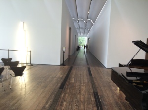
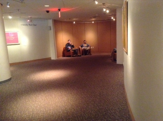
menil hallway


It’s a low-key, expansive space, all on one level. Most of the galleries and other public areas are filled with natural light. Wood floors are comfortable to stand on and add visual warmth. It’s one of Renzo Piano’s more successful museum buildings, I think. Best of all, admission is free, thus eliminating a major barrier to access.

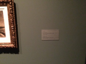
menil label_2

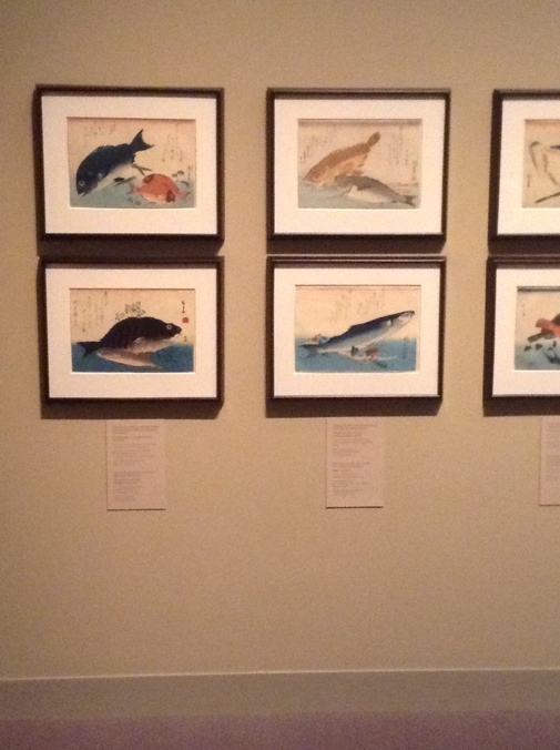
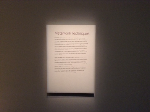
I had two major beefs. First, the labels are tiny and low-contrast — virtually unreadable unless you get right close up.

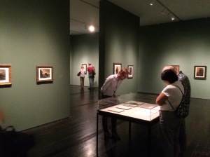
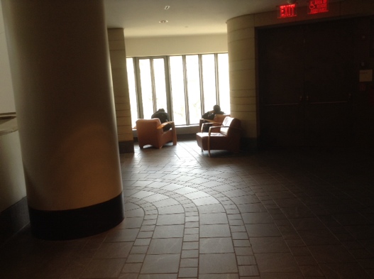
menil no seating

Second, the Menil has a bad case of We’re An Art Museum, So No One Gets to Sit Down. Galleries were woefully short of seating, for no good reason that I could see except It Clashes With the Look.

If it weren’t for these two fundamental access issues, the Menil would be an excellent museum in terms of visitor experience.

Brutalism has its charms

May 5, 2014

Washington, DC is a city of many, many museums. However, most are closed by the time the working day is over, and none are usually open at night, except for movies or performances. For the daily comfort and pleasure of the average working resident, museums matter a lot less than streets, public spaces, and buildings.


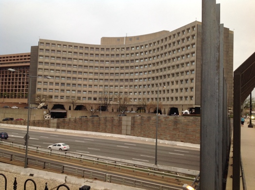
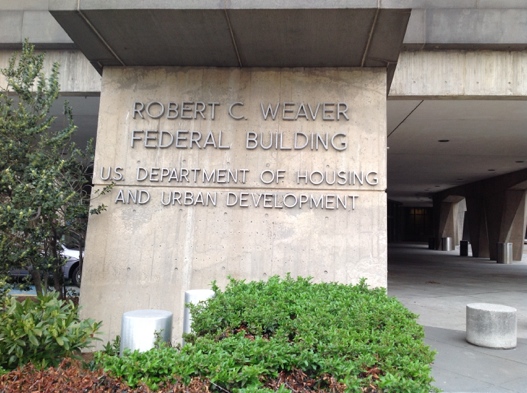
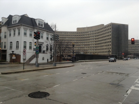
HUD building 1

One prominent, even historically significant, building is the Robert C. Weaver Federal Building, headquarters of the Department of Housing and Urban Development. From the neighborhood of Southwest, you see it brooding over the highway that divides that quadrant from central Washington.


HUD building 2

Designed by Marcel Breuer and completed in 1968, it’s ugly and forbidding in a way that’s all too common among federal buildings of that era. Some of the ugliness derives from the Brutalist exterior: slabs of stained and weathered raw concrete. Mostly, though, it’s simply an ugly, awkward design.


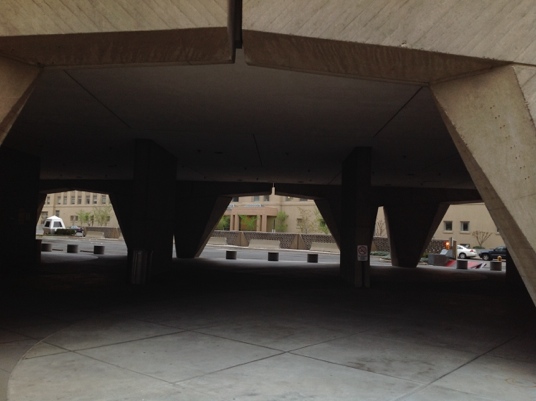
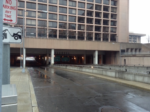
HUD building 3

However — also like many buildings of that era — it has a saving grace, from a pedestrian’s point of view: you can walk under it.


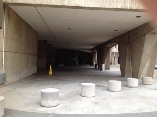
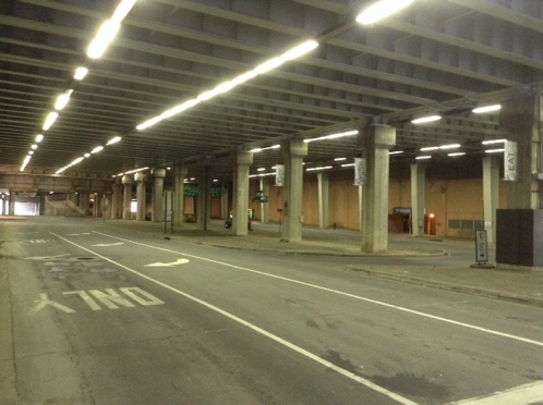
HUD building 4

Pretty much the entire sidewalk level of the building is a giant arcade. An ugly, dark, and severely utilitarian arcade, but in a city of hot summers and frequent precipitation, any shelter is better than none.


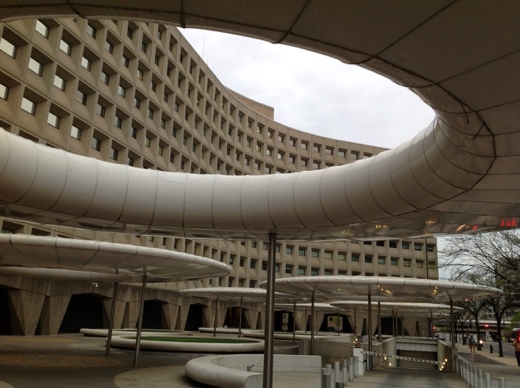
HUD building 5

One unintentionally comic touch, in the plaza facing 7th Street, is a cluster of donuts or flying saucers. Originally, Breuer left this plaza completely bare of seating, shade, or any other amenity for pedestrians. These elements were added in the 1990s with the intention of providing something for people to sit. In my anecdotal observation, they are never used.


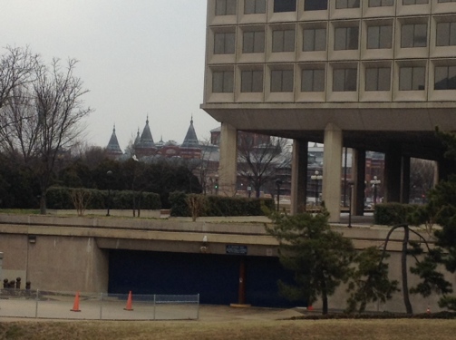
HUD building 6

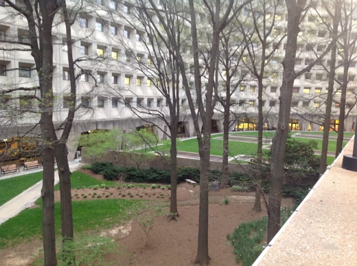
The building does yield one pleasant secret, however. On the west side, tucked in between it and the next building over, is a small green park-like area that should provide a bit of relief from the summer heat. Such spaces are too rare in Washington. This one is even accessible to people with limited mobility.


National Museum of the American Indian

April 7, 2014


NMAI exterior

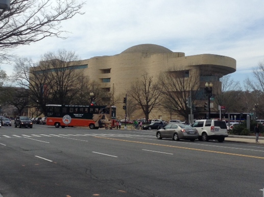
The National Museum of the American Indian in Washington, DC is housed in a large, impressive building on the National Mall.


NMAI exterior detail

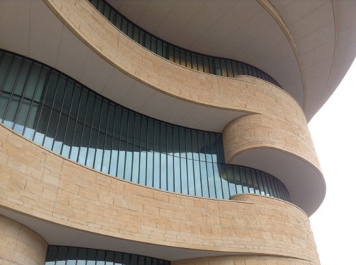
The “sweeping curvilinear architecture,” according to the NMAI website, is meant to help give visitors “the sense and spirit of Native America.”


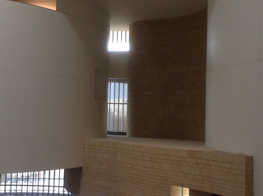
NMAI atrium dome

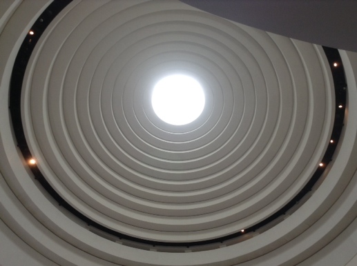
The interior is dominated by a soaring atrium that, whatever its Native associations, puts me in mind of Frank Lloyd Wright’s Guggenheim Museum.


NMAI atrium floor

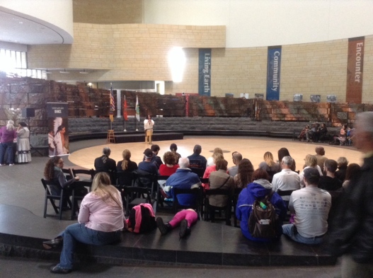
As in the Guggenheim, the atrium floor has lots of space for sitting down, stretching out, and/or attending a lecture or performance.


NMAI cafe

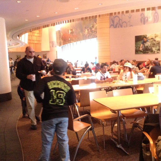
Unlike at the Guggenheim, with its gently sloping spiral ramp, visitors at NMAI have to change floors using either the stairs or the elevator. The first floor is dominated by the restaurant/cafe.


NMAI gift shop

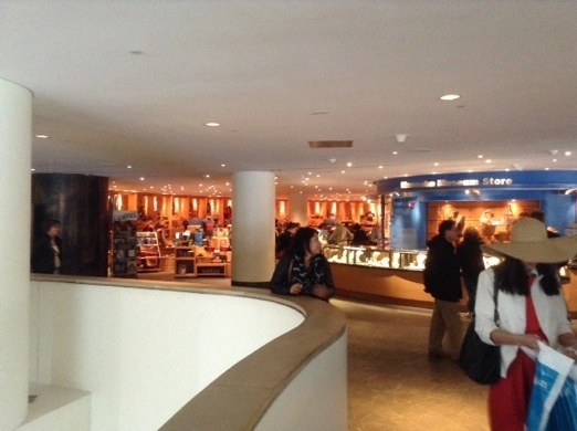
On the second floor, the first thing you see is the large museum store.


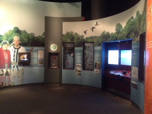
NMAI gallery 1

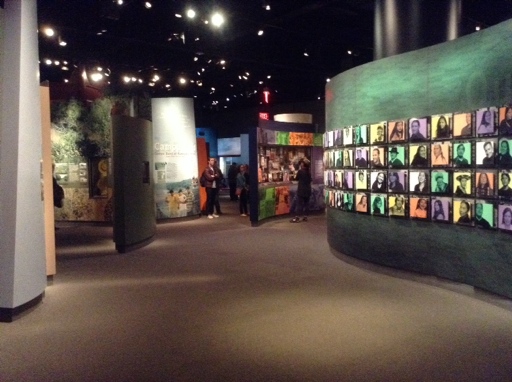
Thanks to the dominance of the atrium, the galleries are relegated to the back half of the museum. In terms of visitor experience, they are nothing to write home about.


NMAI gallery 2

The permanent exhibitions include a standard mix of images, (lots of) text, electronic media, and life-size or semi-immersive exhibit components.


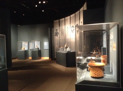
NMAI gallery 3

Traveling and temporary exhibitions tend to rely on traditional vitrines and wall displays.


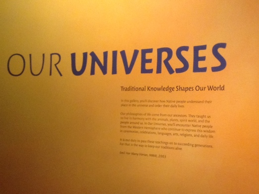
NMAI wall text

Generally speaking, text is reasonably accessible — large enough and high contrast.


NMAI text 2


One very enjoyable feature of NMAI is that there are lots of places to simply sit, relax, and reflect…

NMAI sit space 1


NMAI sit space 2

… Many of them looking out a window, offering valuable relief to the eye and the spirit.


NMAI window

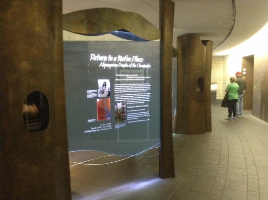
On the plus side, there is lots of natural light. On the minus side, there is lots of wasted space — empty areas that add nothing to the visitor experience.


Since the museum opened in 2004, much has been written about how successful NMAI is or is not in presenting the “American Indian experience” (if such a thing can be presented in a museum) — not to mention the Smithsonian’s vast holdings of Native objects. Speaking personally, I leave disappointed every time I visit. Too much space, too many bells and whistles, not enough objects, not enough tribes represented. For all the good will that went into its creation, there should be more.

Freer Collection, Washington, DC

April 5, 2014


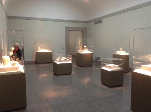
The Freer Collection is one of the smaller, quieter museums in the Smithsonian complex. The galleries are refreshingly uncluttered.


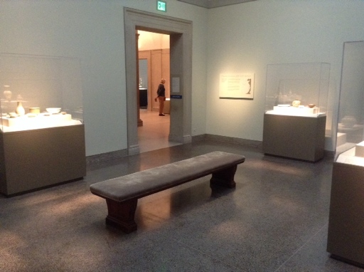
Freer gallery with seatingq

 Some have seating.


Freer no seating 

Many do not.


Freer courtyard

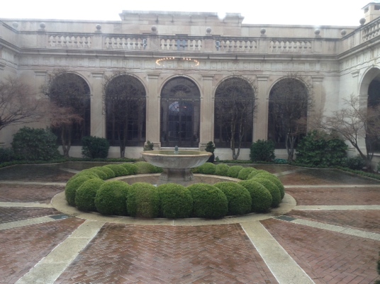
The museum is built around a graceful courtyard, which offers eye relief as well as a tranquil outdoor space in good weather.


 Freer bench with arm rest

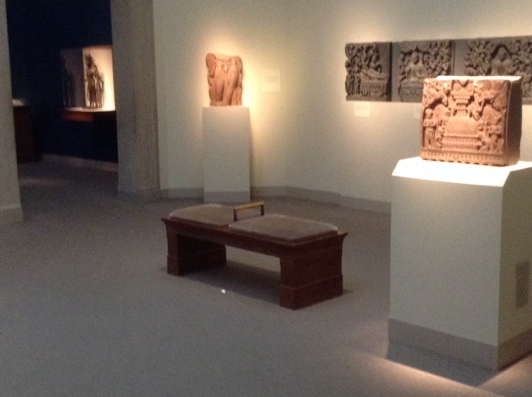
A few galleries have benches with arm rests — a feature that enables visitors to stand up and sit down more easily.


Freer wall label

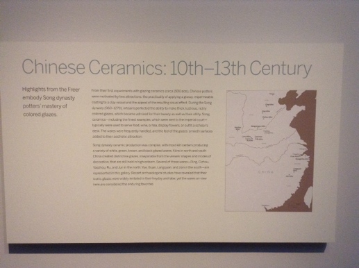
Wall labels are adequate, for the most part, although the body text size should be larger for true accessibility. The labels should be more brightly lit too.


Freer bad label

One gallery had labels that were designed and hung in a truly maladroit manner — small type, low contrast, poorly lit, and well below eye level for most visitors.


 Sackler label

Meanwhile, an exhibition in the adjoining Sackler Gallery had well-lit, high-contrast labels at a good height. There is no reason the Freer could not do the same. 

Retro-Future Washington, DC

March 13, 2014


View of street in SW Washington

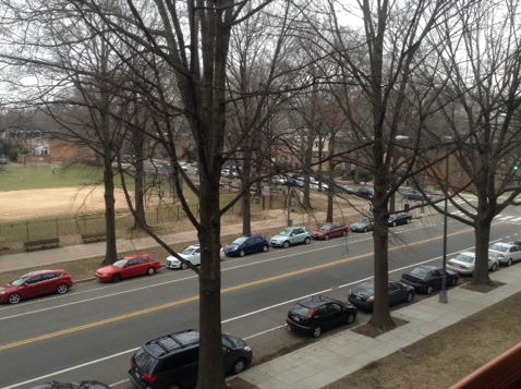
When I visit Washington, DC, I generally stay in the quiet, friendly, tree-lined neighborhood known as Southwest.

View of SW

It’s not the well-known Washington of stately neoclassic buildings, famous monuments, and cherry trees.

Much of Southwest was wiped out by so-called urban renewal in the 1950s and 60s, when planners were in love with the idea of destroying the old-fashioned urban grid, with its pedestrians and human-scaled buildings and street life, and replacing it all with freeways, giant buildings, and parking lots.

Old and new building together

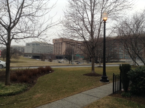
Such a freeway separates Southwest from the very heart of Washington — from the National Mall, in fact — and the result is incoherent and strange. The zone between Southwest and the Mall is a sort of demented, brutalist Radiant City gone dark.


Building on stilts

Buildings on stilts with highways running under them!


Underground parking zone

Soulless, creepy zones devoted entirely to automobiles!


More stilts

More stilts on top of crumbling overpasses!


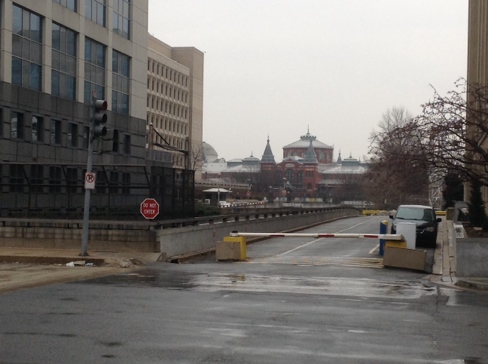
Ugly structures and Smithsonian

… All within a few minutes’ stroll of the Smithsonian Castle, the other museums, and the Mall.


It’s the result of a conscious decision by planners and politicians to favor the automobile over people — a bias that is still very much evident in the Washington metro area today. I hope that some of my future posts will examine the consequences of that decision.


Monterey Bay Fisherman’s Wharf: Runaway Success

March 1, 2014

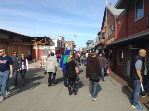
View of crowds on Fisherman's Wharf


Fisherman’s Wharf is the heart of a highly successful and heavily used public space in Monterey, California. On a mild afternoon in February, the crowds were thick and cheerful.


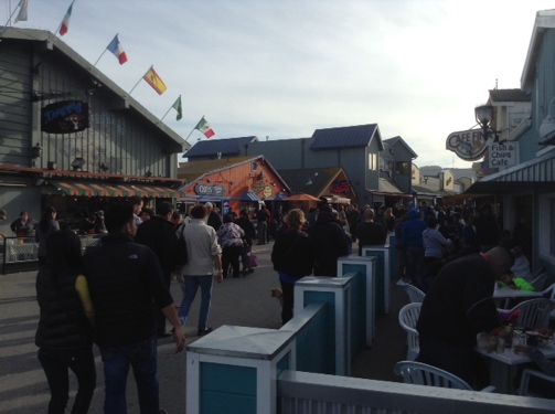
View of the wharf, late afternoon

Unlike the wharf in San Francisco, this one actually has fishing boats nearby, and the restaurants serve a certain amount of fresh local seafood.


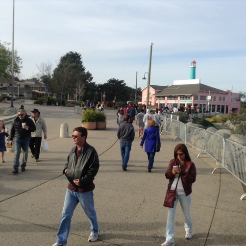
Strollers on trail

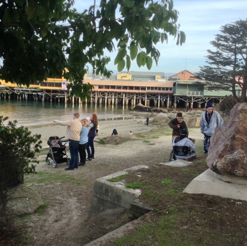
The Wharf is just one feature along the Monterey Peninsula Recreational Trail, which runs for miles along the shoreline of the Monterey Bay. A very popular paved and accessible part of the trail connects the Wharf and downtown Monterey with the Monterey Bay Aquarium.


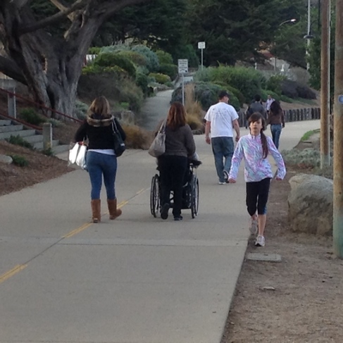
Strollers and wheelchair user on trail

 The trail, a converted railroad line, is a great example of a public space that actually encourages public use. A wide variety of  people of all ages and physical abilities were getting out and enjoying themselves along the shore of the beautiful Bay.


People enjoying the trail and the bay


Update: Sue Bierman Park, San Francisco

February 11, 2014

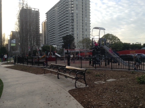
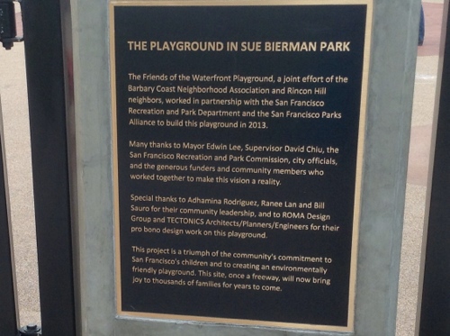
Sometimes, public space in San Francisco actually gets improved. That’s the case in Sue Bierman Park, down by the Embarcadero, where a playground opened in 2013. 

Photo of children's playground at Sue Bierman Park, San Francisco

In an earlier post, I expressed skepticism that this might occur, and am happy to be proved wrong.

plaque commemorating the construction of the playground at Sue Bierman park

Meanwhile, in a nearby tree…

Photo of tree near park

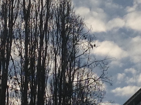
The local parrots amused themselves as usual, with no need of a slide or swings.

Photo of parrots in nearby tree


MoMA NYC: Still Pretty Dim

November 30, 2012

On a recent trip to New York City, we stopped in at the Museum of Modern Art. An otherwise interesting exhibition on the work of the Brothers Quay was marred by a series of ridiculously unreadable labels in a gallery that featured the artists’ dioramas.

bros q dim label

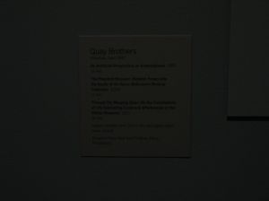
Yes, there’s a label in that murk. The image was taken using the available light in the gallery.

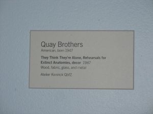
If a visitor came equipped with night-vision goggles, a flashlight, or the eyes of a nocturnal creature, a label might look like this:

q b lit

For most of us, however, it looked like this:

bq black

This is the opposite of access, comfort, and common sense. There is no excuse for it.


Pedestrian Arcades: Good enough for the Renaissance

September 14, 2012

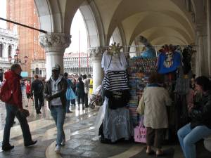
Summer here in San Francisco has been foggier than usual, which gets me thinking of our looming rainy season–which in turn puts me in mind of a great idea from the Renaissance that we encountered on a  visit to Italy a couple of years ago: pedestrian arcades.

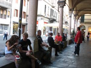
They are a common feature in public buildings from that era, and work very well at their intended function of protecting people from harsh or inclement weather so that they can go about their lives, errands, and business in comfort. They function in rain, in sun …

… and often come with built-in seating. A brilliant example of human-scale design. I often wonder why more buildings in the Bay Area don’t have them. After all, it rains here about half the year, and at other times it can get quite hot and sunny, especially outside of San Francisco proper.

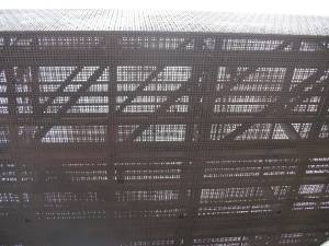
Instead, we have overhead structures that don’t effectively keep off the elements, such as this porous faux-overhang at the De Young Museum (viewed from beneath):

Union Square in SF also has shelter-like structures that provide no actual shelter. Puzzling.

The Monetization of Golden Gate Park

August 20, 2012

Exposed as it is to the fog and cold winds of the Pacific Ocean, San Francisco’s Golden Gate Park is not, on many days, the most comfortable public space on the planet. But it is a major urban park–an attraction for visitors and a refuge for residents.

Over the years, more and more areas of the park have either increased their entry fees or started charging for the first time–without adding in any way to the quality of the user experience.

The California Academy Academy of Sciences, which had been a charming, low-cost, and engrossing natural history museum for generations, re-opened in 2008 after a total renovation with a swanky Renzo Piano-designed building…
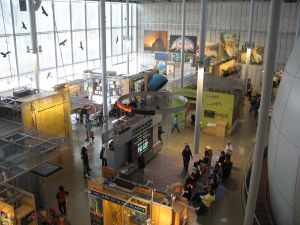
…and a radically higher price structure. As of this writing, it’s $29.95 for each adult, and $24.95 for teens, students, and seniors. It’s obviously geared primarily for out-of-towners as a “wow” experience, to be visited once and (quickly) forgotten.  Compared to the old, low-key Academy, which was worth revisiting again and again, it’s a ripoff and a real loss.

Across the concourse, the de Young Museum charges a relatively modest $10 (!) per adult–but charges extra for special shows. Moreover, the fancy-schmancy Herzog & de Meuron-designed building, which opened in 2005, is not holding up well. The copper facade, which was supposed to (according to the museum’s website) “assume a rich patina over time that will blend gracefully with the surrounding natural environment,” has become merely stained and shabby-looking. And the asymmetrical tower is simply intrusive in a park setting.

The nearby Conservatory of Flowers was free until 2003, when it reopened after a four-year renovation following severe storm damage. It’s an important historic structure, and well worth preserving. Yet I still remember the night of the reopening. Beth and I were walking in the neighborhood and noticed fireworks over the park. We learned the next day that there had been a grand reopening gala–a private, invitation-only party for donors and VIPs, at a public facility that had previously been free to all. Since then it’s mainly been a tourist attraction.

The Japanese Tea Garden, which charges five bucks for SF residents and seven for non-residents, was also free once upon a time. (If you hustle, and you don’t have to be at work like most people, it’s still free during the first hour of business on Mondays, Wednesdays, and Fridays.) However, it at least provides a high-quality experience and a real sense of refuge from day-to-day cares, so you could say that it’s in the realm of being worth the money.

The real travesty is down the road at the San Francisco Botanical Garden, known for decades as the Strybing Arboretum. It was absolutely free until the forces of privatization–namely the SF Botanical Society and the current leadership of the city’s Recreation and Parks Department–succeeded in imposing an admission charge for non-residents while changing the name, all in the service of a vague and grandiose plan to create a so-called “museum of plants.” Since the fee was instituted in August 2010, residents as well as visitors have been staying away in droves, as you can observe on any sunny mild weekend day (we do have them).
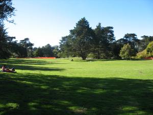
On such a day, this lawn used to be packed. Something about the process of having to show ID at the (ugly) entrance booth discourages residents; the fee keeps out mixed groups of residents and visitors. In essence, a beautiful, quiet, car-free open space on public land has been taken away for–what? The overall plan and the economics that are supposed to support it are a mystery. What use is an admission fee if no one pays it?