Posts Tagged ‘museum exhibitions’

Guest post: Royal BC Museum, Victoria, British Columbia

January 9, 2012

Our friend Dotty DeCoster, a dedicated and thoughtful museum visitor, recently visited the Royal BC Museum in Victoria, British Columbia and sends this report:

“We went up to Victoria for a few days over Christmas weekend and among other visitations and ramblings about town, visited the  Royal Museum, which is right on the waterfront next door to the Parliament Buildings (for B.C.).

“This museum remains what I think of as the quintessential natural history/provincial history museum.  I do not understand why the dioramas here are so much more lovely and interesting than those in other places — and I’ve seen dioramas in many, many places.  But they are.  Perhaps it has something to do with the way that each one is treated separately, based on its theme, and each is uncluttered while containing just the right number of exemplar artifacts?  I really don’t know.  But they are wonderful.  New to me was the ‘undersea’ display — one is in a model (20,000 Leagues Under the Sea style) undersea module.  It is a treasure, with interactive displays built in.  (The older displays have been added to with nearby hands-on opportunities, games, and activities.)

Ocean Station, Natural History Gallery, Royal BC Museum. Copyright Royal BC Museum.

“But best of all, this museum has seating in every single display, along with devoting all of their “wasted space” (really well lit view corridors) to seating.  It is truly comfortable to be in this museum, to take time at each display.  The model town and the amazing space devoted to northwest coast native artifacts are not quite so well endowed — which is to say that there is seating, but it is not quite so integral to the display cases, and they were designed expecting people to climb stairs (but there are ways to avoid this).

Old Town, Modern History Gallery, Royal BC Museum. Copyright Royal BC Museum.

“The museum has an inexpensive cafe, lots of restrooms, and a whole wing devoted to a comfortable seating area which serves as a living room for visitors to Victoria, whether or not you pay museum admission.  There’s also a store, but we didn’t have any trouble avoiding it.

“In terms of displays, although I like the whole museum and admire the taxidermy, the most important exhibits (in the sense of world wide interest) are certainly the Northwest coast native (aboriginal, I believe, is the Canadian term) collection.  The collection is extensive, inclusive, and well interpreted.  Low light, of course, because they are actual artifacts, not copies.

Kwakwaka’wakw Masks, First Peoples Gallery, Royal BC Museum. Copyright Royal BC Museum.

“Take your time, then go find a seat and rest, then come back.  It’s a lot to take in on one visit.  Escalators serve the exhibition floors.  (I like this — you can peek at things as you go from one floor to another.)”

Thanks, Dotty!

(Note: Photos were downloaded by me from the museum’s website)


Death Valley Museum: The comfort of the familiar

March 29, 2010

Death Valley National Park is one of our favorite places on the planet. One of the things we like about it is that because it is so isolated, very little changes over time, at least in terms of human impact on the landscape. Except for a much-needed campground upgrade or two (and the disappearance of the date milkshake stand at Furnace Creek, alas), most of the buildings and facilities are pretty much physically the same as they were 20-plus years ago when we first started visiting … including the museum at the Furnace Creek Visitor Center.

As far as I can tell, the building has remained essentially the same since it was built in the 1960s (I think), back when this was Death Valley National Monument. And judging from the exhibits, the museum has not changed either.

With its static exhibits, photo displays, and stuffed animals, the Death Valley Museum is a time capsule of 1960s museum practice and philosophy.

And that’s not necessarily a bad thing. Most of the year, Death Valley is hot and intensely bright. The vistas are long and shade is hard to come by. It can be overwhelming, visually and physically. A visit to this quiet, dark, contemplative space provides welcome relief to the senses and the spirit. At least in my observation, visitors — kids included — slow down here, lower their voices, and quietly take in the old-fashioned exhibits. 

What’s more, the exhibits are well-written and informative.

There’s even comfortable seating.

At this point, the museum itself has become an historical artifact in itself — the kind of place a parent can take a child and say, “It was just like this when my parents took me.” I think there’s a great deal of emotional comfort in that continuity, in addition to the physical and psychic comforts of coolness, dimness, and quiet.

That’s all on the brink of changing. For many years, Death Valley was a total backwater in terms of telephone and computers. There were old-fashioned land lines, and beyond that, nothing, unless you had a satellite phone. But now there’s wi-fi, bringing with it the sight of people slumped against the wall of the Visitor Center working on their laptops. Cell phone service, at least at the main commercial centers of Furnace Creek and Stovepipe Wells, will start soon, along with all the intrusive babble: so much for quiet.

And the museum is next. According to the latest Death Valley Visitor Guide, stimulus funds have been set aside to upgrade the museum exhibits. My fear is that audio and video will come crashing in — and to what purpose, really? There are subtle ways to make the current exhibits more accessible to a wider variety of visitors, but the likelihood is that they will instead be replaced with cookie-cutter, characterless interactives, turned up too loud. I hope I’m wrong.

I hope that at least they keep this very cool topographic Death Valley diorama:

Besides being beautiful in itself, it’s an example of an art that is no longer much practiced — which is a loss to us all.

Metropolitan Museum: Return of the American Wing

September 21, 2009

When we visited New York City in September 2009, we were delighted to discover that the American Wing of the Metropolitan Museum was open to the public once again. 

Am Wing plaza view

In spite of some changes that in (Beth’s opinion particularly) make it a somewhat colder, less visually coherent space, it’s still one of the great interior spaces in American museums — an indoor piazza. 

The American Wing Cafe is open once again, and the prices are still reasonable. We were momentarily disturbed to realize that the windows have been frosted over.

Am Wing cafe

“The view is gone!” we said. But there’s a good reason, which becomes apparent as soon as you climb the stairs to the newly-added mezzanine right above the cafe.

Am wing outside view

It’s a construction site out there, and the Met is simply preserving the esthetics of the American Wing experience.


Am wing pardon appearance use this

The mezzanine itself, although it adds a ceiling to the Cafe that’s a little low for psychological comfort, is put to good use as an exhibit space.

Am Win mezzanine


Meanwhile, the piazza itself, while not as tranquil and intimate as it was before the remodeling, still has a variety of places for people to sit.

Am Wing seating


There is still a fountain. Like all fountains, or any element featuring water for that matter, it is extremely attractive to visitors.

Am Wing fountain

Visitor comfort in museums: Readable labels

March 29, 2009

There are some very simple things museums can do to help a great many visitors work less hard and be more comfortable. One of the first is to create readable labels with large type and a contrasting background,  placed at a height comfortable for most visitors.

 slide-2


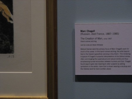
Readability can depend on something as simple and basic as background color.

slide-3 


slide-4  

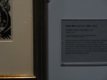
These two labels are practically side by side in the same gallery. They are lit the same way. The designs are identical except for the background color.


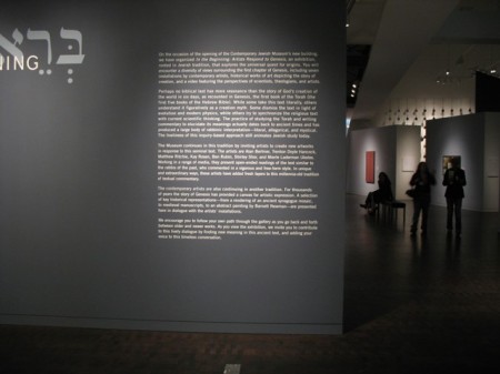
Contrast can be light on dark as well as dark on light– although this motif should be used sparingly, because it’s more fatiguing. This text was readable from four or five feet away:

slide-5


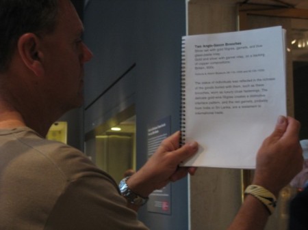
From the Metropolitan Museum of Art in New York City, here’s an adaptation for visitors with visual impairments or anyone else unable to read the wall labels: a spiral bound book of label text.

slide-6


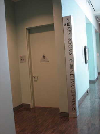
General signage should be prominent and highly legible as well. 

slide-7